Courses
The Courses tab shows whether assigned training is completed, how well users score, and who is falling behind. Filter the tab by date range, Department , Location , Course or User , the same way as t…

The Courses tab shows whether assigned training is completed, how well users score, and who is falling behind.
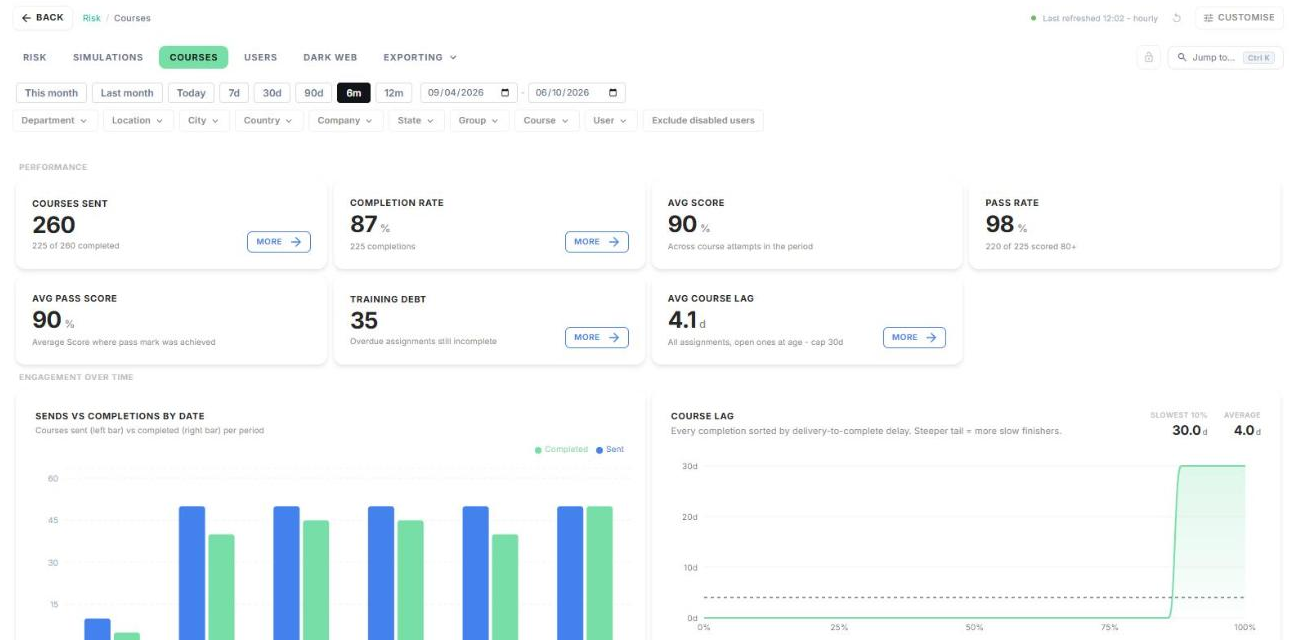
Filter the tab by date range, Department, Location, Course or User, the same way as the Simulations tab.
Performance
The cards show courses sent, completion rate, average score, pass rate (80% or above), average pass score, training debt (overdue courses) and average course lag. Click More for detail.
Engagement over time
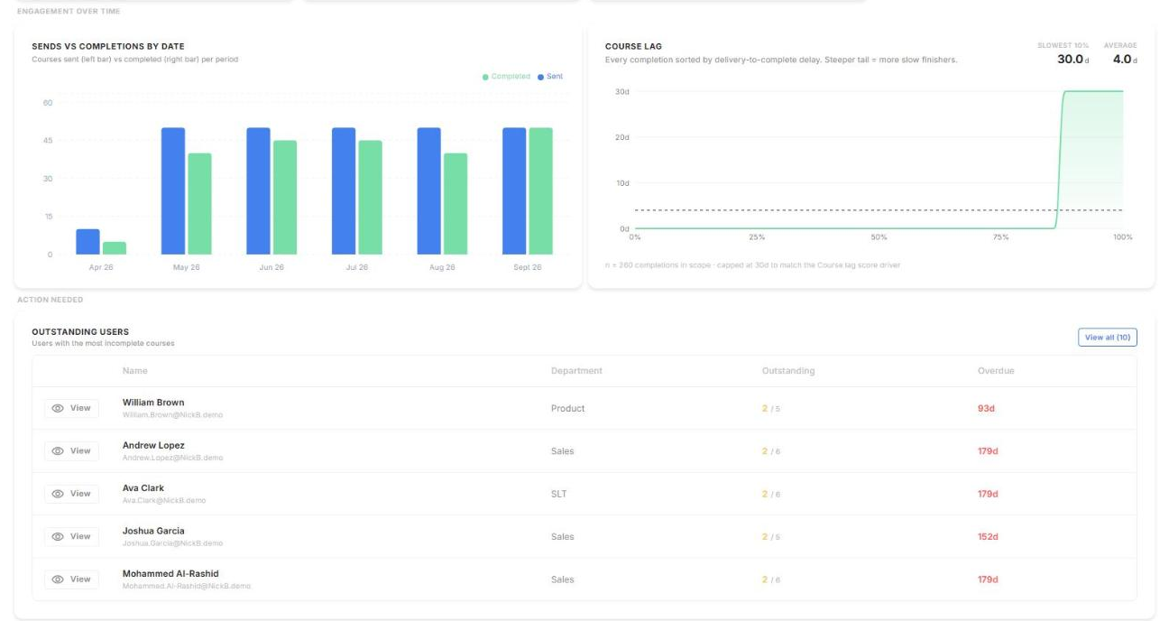
Compare courses sent against courses completed. Course lag shows how long completions take: a steep tail means many slow finishers.
Outstanding users
Under Action needed, see the users with the most incomplete courses and how long they're overdue. Click View all for the full list.
Completion breakdown
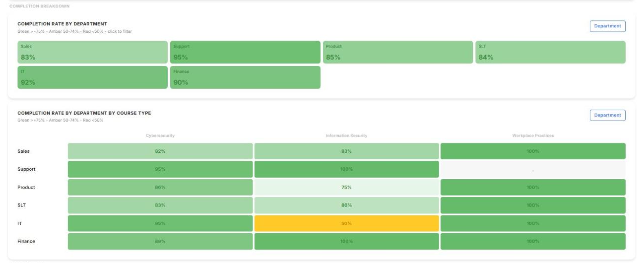
Completion rates by department, and by department and course type. Green is 75% or above, amber 50–74%, and red below 50%. Click a department to filter the tab to it.
Score quality
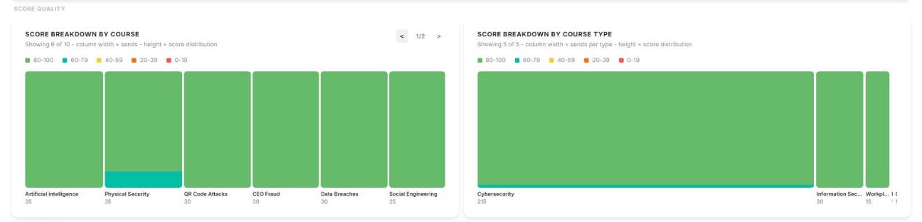
See how scores are spread across each course and course type. Wider columns mean more sends.
At the bottom of the tab, All courses, Users and Course send history give the detail behind the charts. Click View on a course to see its recipients, their status, outcome and score.
How did we do?
Simulations Page
Users Page
