Risk Page
This page will walk you through the risk page, the widgets, what they mean and how the scores are calculated. Risk Score. The Risk Score is a single number from 0 to 100 that shows how risky your org…

This page will walk you through the risk page, the widgets, what they mean and how the scores are calculated.
Risk Score
The Risk Score is a single number from 0 to 100 that shows how risky your organisation's behaviour is. Lower is better.
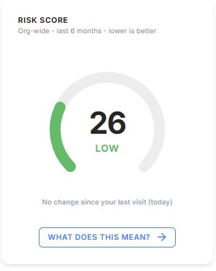
It covers the last 6 months and shows the change since your last visit. The score falls into one of four bands:
- Low (0–29): consistently safe behaviour.
- Medium (30–55): some risk signals; worth keeping an eye on.
- High (56–75): repeated or more serious risky behaviour.
- Critical (76–100): urgent; high-risk behaviour across several signals.
Clicking What does this mean? will show how the score is built.
How the Risk Score Is Calculated
Every active user gets a score built from five behaviours over a rolling 6-month window. The organisation score is the average of all active users' scores.
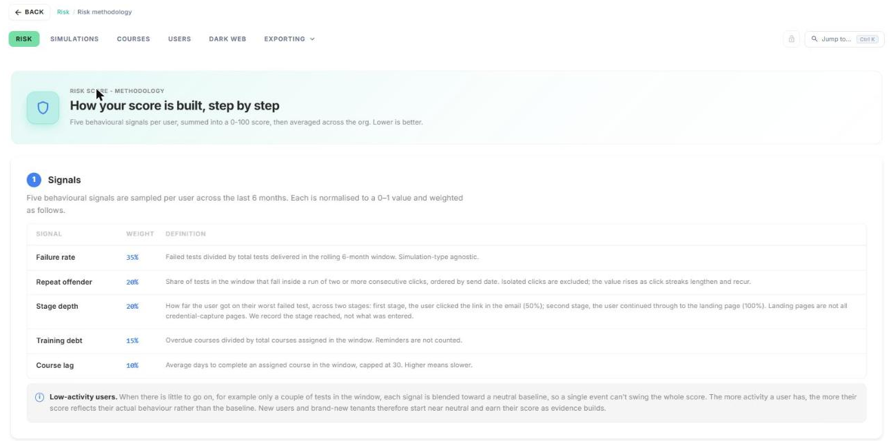
The five signals
- Failure rate (35%): failed tests divided by tests delivered.
- Repeat offender (20%): the share of tests that fall in a run of two or more clicks in a row.
- Stage depth (20%): how far the user got on their worst failed test. Clicking the link counts as 50%, and going on to the landing page counts as 100%.
- Training debt (15%): overdue courses divided by courses assigned.
- Course lag (10%): average days to complete a course, capped at 30.
Good to know
- Active users only. Only users with at least one simulation or course in the last 6 months count towards the score.
- New users start near neutral. Their score moves towards their real behaviour as more simulations and courses arrive.
- The score is smoothed. The displayed score is a recency-weighted average of recent daily scores, so one bad day won't swing it.
- Stage depth doesn't mean credentials were captured. It records how far the user got, not what they typed.
Try the calculator
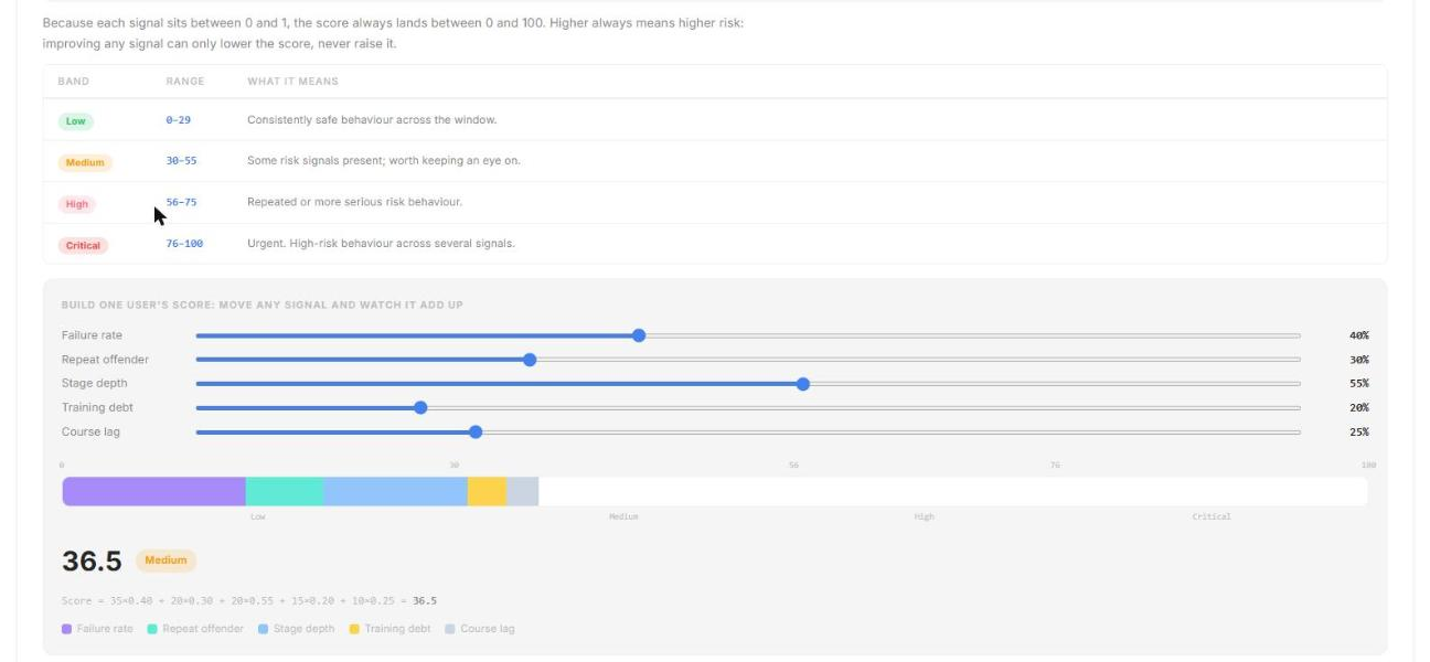
Scroll down to Build one user's score. Move any slider to see how each signal adds to the score.
Benchmark Position
Benchmark Position shows how your risk score compares with your industry and with every organisation on the Boxphish platform.
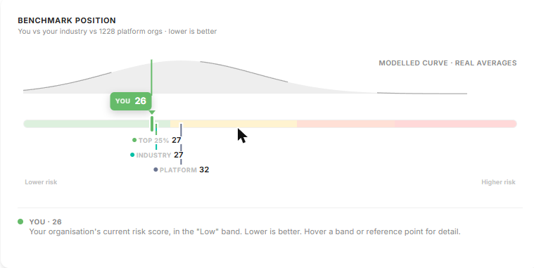
Your score is marked You, alongside three reference points:
- Top 25%: the score the best-performing quarter of organisations achieve.
- Industry: the average for your industry.
- Your industry can be set under Settings > Company Information > Industry (dropdown menu)
- Platform: the average across all Boxphish organisations.
Hover over a band or reference point for more detail.
League Table
The League Table ranks your top 5 departments by risk score, so you can see where to focus.
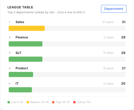
Each row shows the department's user count and score, coloured by band.
Viewing a department
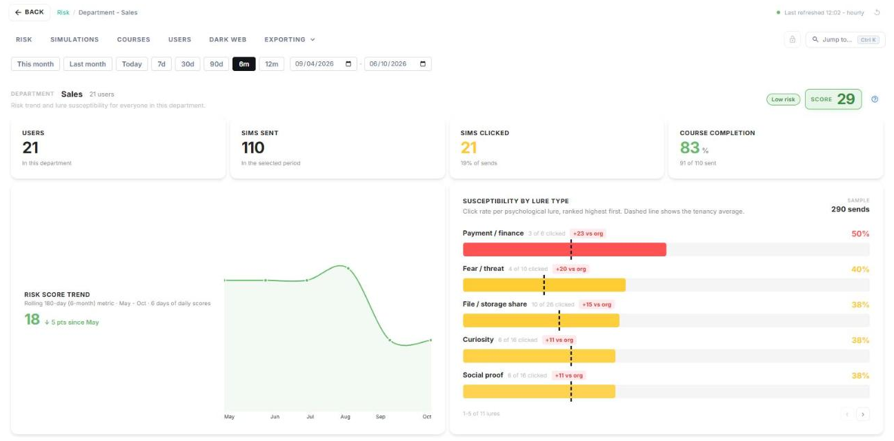
Click a row to open that department. You'll see its score and band, user count, simulations sent and clicked, course completion, and risk score trend.
Susceptibility by lure type shows which types of lure this department clicks most, such as curiosity or payment requests. The dashed line marks your organisation's average.
Partner accounts: when you view a partner tenancy, the League Table ranks the tenancies you manage instead of departments.
Risk Score Trend
Risk Score Trend shows how your organisation's risk score has changed over time.
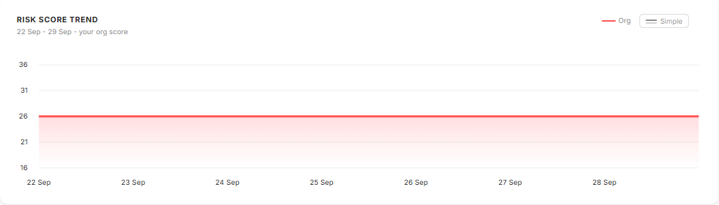
Use Org and Simple at the top right to switch between the two views.
Risk Summary
Risk Summary explains in plain English which behaviours drive your risk score most.
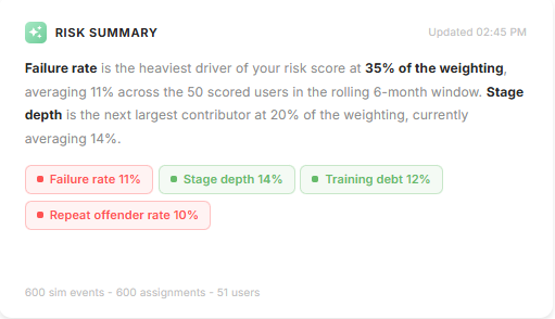
Each tag shows a signal's current value. Red tags are the ones pushing your score up.
Score Drivers
Score Drivers breaks your risk score into its five signals, and compares each one with the platform and industry averages.

Drilling into a driver
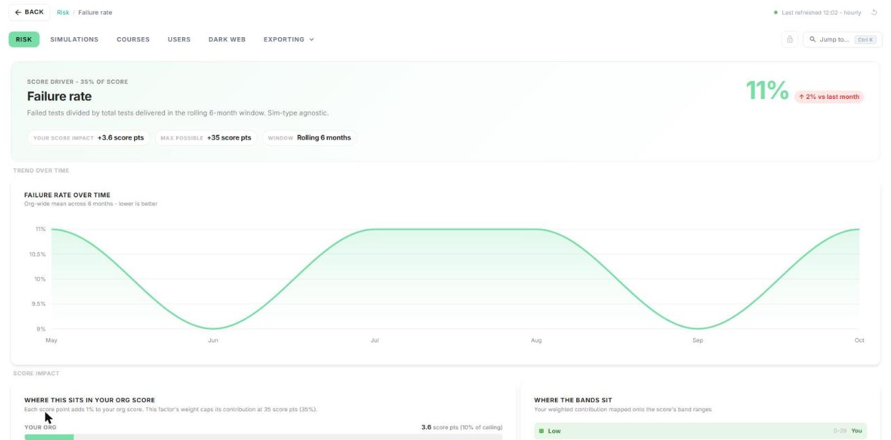
- Click More on any driver card.
- At the top you'll see how many points this driver adds to your score, out of the maximum it can add.
- Scroll down for the trend over the last 6 months, your contribution compared with the platform average, and the users driving it.
Top contributors
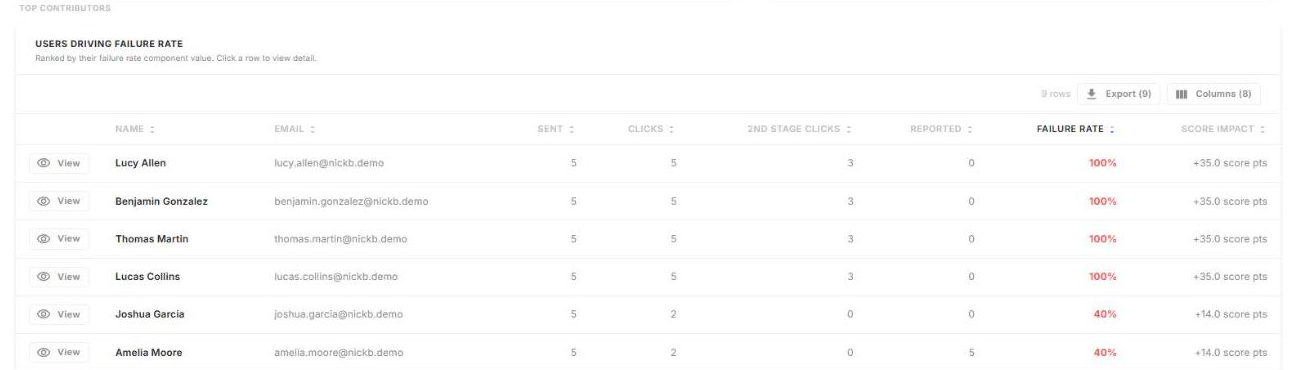
This table lists the users driving this signal, highest first. Click View on a row to open their profile, Export to download the list, or Columns to choose which columns show.
How did we do?
Reports Overview
Simulations Page
